Tuesday, March 25, 2008

Art Donovan's Steampunk Pieces


Art Donovan is a regular reader and commenter here at The Steampunk Home. He's also, as the proprietor of Donovan Design, a designer and craftsman of lamps, lighting, and the occasional home accessory. Art was kind enough to mention his newest steampunk inspired pieces to me, and, of course, I want to share them with you.
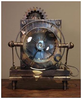


His early steampunk efforts are online at HomePorfolio. First a steampunk clock in distressed brass (who even knew you could distress brass? I assumed you antiqued brass, but this is a very different look than antiquing.) Second is a steampunk style table lamp, with 4(!) different adjustment points.


Art's pièce de résistance, however, is his Siddhartha Pod Lamp, pictured at the beginning of this post. At 52" tall x 30" wide, it's an impressive, piece of work. It's entirely hand crafted of solid mahogany, solid copper and brass. Without a doubt, the most labor-intensive lamp I've ever created. Personally, I see it in the home of a evil mastermind -- something about the curlicue wood at the top reminds me of a mustache twirled by such a dastardly fellow.


Art is known to hang around here at the SPH, so if you have questions for him, feel free to post in the comments. (Mine: What are the vertical glowing light-bulb style tubes? Why name it Siddhartha -- I'm not quite sure I see the link between steampunk style and the Buddha?)

UPDATE! Art sent me answers to my questions:

To answer your questions- Easy! The tall light bulbs are called "Showcase bulbs" and they are really bright- 75 watts each. (#75T8) Add some "Baby Slinkys" around the bulbs and you're ready to go!

I have a dimmer switch for them located at the top of the lamp, (it's that little cone-shaped piece, pointing downward.) When the bulbs are turned all the way up (which I never do) they are massive, ridiculous bright.

All of our lamps are named by my wife and partner, Leslie. She also designs lamps and won't name them until they're completely finished. The "Siddhartha Pod" lantern has design elements of the British Raj Period of India, so that was her inspiration for the name. The "Pod" refers to the strange, vertical shape- (vaguely bio-mechanical like, I suppose).

Tuesday, March 18, 2008

Bars for Inspiration


Victorian style -- the good stuff, that we aspire to -- tends to be a bit, well, stuffy. Stuffy is hard to live with, especially today, when you probably don't have household help to keep it clean and neat and your family congregates in an open kitchen instead of the parlour (with the cooking going on in the basement or a separate building). To counteract this stuffiness, and to be more true to the steampunk aesthetic which includes a healthy dose of dirt and grime, I look to the seedier side of Victorian and Edwardian culture to find inspiration for casual kitchens and eating areas where people can gather and chemistry experiments of various sorts would not be out of place.


The Barcelona bar Marsella, which I stumbled across at A Shaded View on Fashion, is one such example. Opened in 1820 and frequented by the artists of the day, its wood cabinetry, opulent chandelier, cafe tables, and dusty bottles are quite the inspiration.


How to get such a look? Lots of wood, patterned carpet, and a bistro table like this one I've been admiring this one from NapaStyle, which I think it would fit right in to a casual kitchen/dining area inspired by Marsella.


credits: pictures are from A Shaded View of Fashion, table is from NapaStyle.

Friday, March 7, 2008

Love(ly) Steampunk Computer


I don't know if I'll ever get tired of steampunk computer mods -- and this one comes with a love story. This was created as a wedding gift for David Veloz bride -- and used to display a slide show of pictures at their wedding.

To the left of the monitor is a nixie tube clock in a Chinese jewelry box.

More details at the Steampunk Workshop, including a closeup of the lovely 1880s-looking Mac mini.

Thanks to Damon for pointing this out at Make: Blog.

Steapunk Speaker ideas

Reader Simone sent me to this fascinating 3D speaker design contest.


Victrola based speakers? Not a bad idea...


I like the details on top, not so sure about the 1960s pod style...

Thursday, March 6, 2008

Electronics Shadowbox


Not everyone is as lucky as I am. *I* have a power electrical engineer for a father-in-law. I know, I know not something most people are envious of, but my father-in-law has a shop full of old bits and pieces of electronics and industrial equipment salvaged from the oil refineries he builds substations for.

The picture doesn't do it justice, but this is one of my "finds" from our last visit -- some sort of massively parallel power supply/controller mounted in a shadowbox and hung next to my back door. I loved the colors -- bright green capacitors and pink wires, and the fact that it is almost symmetrical but not quite.

As projects go, this was super simple -- remove some rods and screws that were sticking out of the board, buy shadowbox, mount with 4 stickpins, and hang. Not bad for such a unique piece of art!

p.s. My father-in-law wasn't quite sure what this was used for, so if you have an idea let us know in the comments!

Wednesday, March 5, 2008

Architecture of the Eccentric

Reader Lee Oakley pointed out some architectural gems on WebUrbanist.

Above is the Palais Ideal, built by mailman Facteur Cheval in Hauterives, France in the 1800s. Below is a13 story high wooden skyscraper in Archangelsk, Russia by the owner of a small construction company, Nikolai Sutyagin.


I enjoy how individuals can push beyond the realm of the "normal" into the fantastic, unbound by tradition and rules. You may not have the stamina to create something as awe-inspiring as these works, but they should serve as inspiration for doing the extraordinary, yet still beautiful, for your home.

For more (less steampunk) examples, fuller stories, and links, see the full article.

Sunday, March 2, 2008

Eric Freitas' Clocks

Growing relentlessly in the mind of Eric Freitas lies a realm of dark mechanical curiosities and horological contradictions. In this world gears are harvested and mechanisms are alive with the organic repetitions of nature's machine. Balancing carefully between creative conception and logical execution, this world would slowly be brought to life.

So starts Eric Freitas' biography on Etsy. The work, incredibly, outshines the statement.

Beautiful, wierd, hand-machined -- this not just art attached to an existing quartz movement, but a fully realized working pendulum clock out of brass and rice paper. The particular clock's inspiration is based on the calligraphy of the numbers:

This is my fifth fully mechanical clock. All of the parts were machined by hand, and many of them carry a design congruent with the calligraphy used for the numbers. In addition, a strange and uncontrolled style is introduced to offset the structured nature of the gears. No.5 has a one second pulse and a 'dead beat-style' escapement. The seven swivels out of the way to expose the winder, which needs to be employed about once a week ( 8 days ). Adjusting the timing of the pendulum is easy, and if done correctly this clock will be accurate within a minute or two a week.

Another one (quartz rather than mechanical) I'm not sure I'd ever want to see strike midnight:


Eric has 2 clocks for sale on Etsy -- the first one above and a more economical one based on a quartz movement. For a full history of his work -- many are no longer available -- you'll want to view Eric's flickr stream.


Isn't it clever and elegant how the numbers become the decorative elements here?

His workmanship is utterly amazing.

Thanks to the blog at Coilhouse for pointing these out.

Airship Chandelier, anyone?


At 1stDibs. This seems to be made almost entirely of small glass beads. Circa 1960.

I can't quite tell who spotted this first, but I found it via Kaboodle.

More airship posts.

Saturday, March 1, 2008

Keith's Steampunk Study


Reader Keith says "I hadn't realized how steampunk it had gotten until I converted the photo to black and white," about his study, and sent along some pictures for us to enjoy.

I found the hammock outside at an antique store at the end of the summer and they didn't want to store it. It was $150. It is a tapestry like fabric, fringed on the sides with a built in pillow stuffed with what feels like straw. Quite comfortable for reading with the cat on my lap.


The press was in another store listed as a wine press. It is wooden and very solid. I personally think it was used for bookbinding or something along those lines.

The certificate is actually a framed letter and envelope from 1900ish. It is from a brewery to a customer discussing a shipment and a pending tax on beer that is coming into effect soon.


On the light:I found it at home depot as an accessory light for a ceiling fan. Mounted on its own it adds a steampunk touch.

I love how this study reflects the inhabitants interests -- I'm guessing Keith is a home brewer, without even asking (a very steampunk pursuit, with all that turning water & grain into beer with pots, copper tubing, and large glass vessels...). My favorite part is the hammock -- who would have though to put a hammock in a study? Yet it's a comfortable spot year round, and great for visiting friends/spouses/kids.

I think this study illustrates how you can go about building steampunk style simply. Let your interests (which one assumes leans towards the antique and DIY, if you are attracted to steampunk) dictate your choices. Switch out just a single element like a light. One step at a time, and before you know it, you'll be surprised by how steampunk it's become.

Want a hammock of your own? Victorian Trading Company has a similar one for $199.


The light is what really makes this room steampunk -- and the good news is that this style is easy to find. Here's one in the same vein from lightingdirect. I love it -- wire encased, nautical looking -- gets you simultaneously an antique and industrial look.

The Thieving Magpie -- Cabinets from Found Objects

Corvine's Calling

Roger Wood of Klockwerks sent out links to his favorite artists. I was taken by these cabinets by Richard Dunbrack of The Thieving Magpie. Each piece's description includes the original parts "provenance", i.e. "early eel spear" "Victorian house fragments" or "iron gate fragments"

They remind me of something you'd find in the Weasley's house in Harry Potter -- mundane artifacts turned into something fantastic.